Display the distribution of risks, response option data, or activities per unit in a gadget on dashboards.
This article covers this specific gadget. Learn how to add and manage gadgets on the dashboard here.
Description
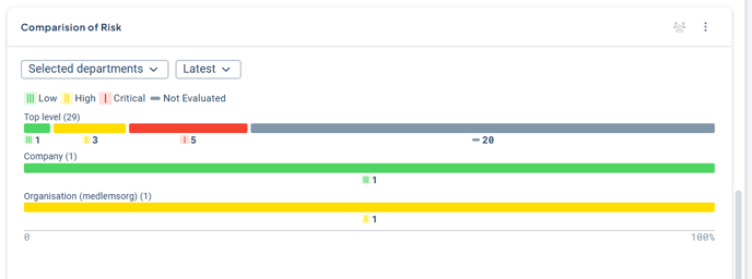
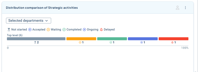
The Distribution Comparison gadget displays the distribution of risk levels, response options, or activity statuses divided by unit or keyword. You can access additional information by interacting with the gadget.
For risks and response options, you can select the year for which you want to view the assessment using the year selector (since activity statuses are not periodized, this option is only available for risks and measures).
Requirements and Permissions
- You need a product license to be able to create the gadget.
- To display risks, the new matrix must be enabled and risk measures must be configured. Read more here: New Risk Matrix and Risk Measures
- To display response options with “custom colors”, the colors must have been updated to the new color palette. Read more here: [LINK] New Icons and Colors in the Platform
- To display content in the gadget, there must be a dataset that contains (at least) a correctly configured risk measure column, activity column, or measure column with response options. Read more here: Datasets.
- The gadget can be created both on the “My Work” dashboard and product dashboards. Only full administrators can add the visualization, except on product dashboards, where product dashboard owners can also add the visualization. However, a full administrator must first have created the underlying dataset.
- To view the distribution information, you must have permission to see data from the units displayed in the gadget, but information is shown for all organizational levels where it has been distributed.
Create a Distribution Comparison Gadget
The gadget is based on a custom dataset. To ensure the gadget can display the correct data, you need to create a dataset that includes (at minimum) the risk measure column and/or activity column from your control model that you want to use for total distribution of risks or activity statuses.
The dataset can contain more information than what you choose to display in the gadget.
You can also pre-filter your dataset. Read more about how to create your dataset.
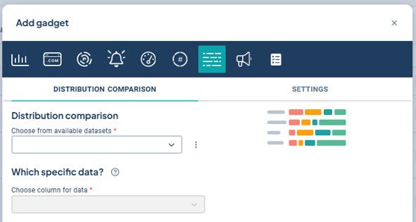
Open your dashboard (in the example below, a product dashboard) by selecting the product for which you want to add the gadget. From your product dashboard (1), click “Add gadget” (2), and then select the “Distribution Comparison” gadget (3):
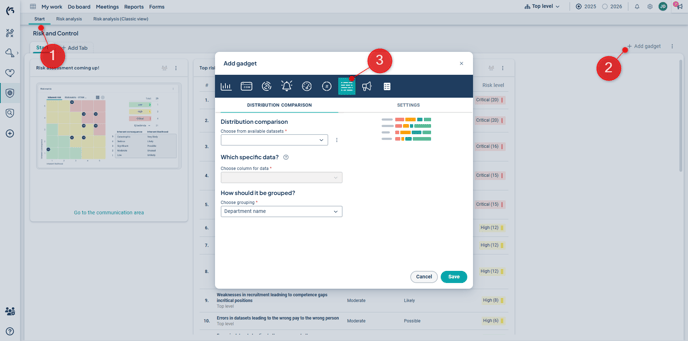
Start by selecting a Dataset. If you don't have a suitable Dataset, you can go directly to the administration from here if you are a full administrator.
For Activities: Select the activity column as the data column. Only activities that have been updated to use the new colors and icons will be displayed. Then choose grouping (2). Read more about groupings below.
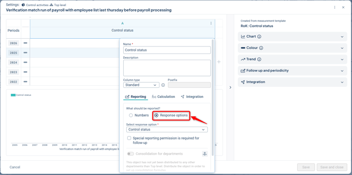
For response options: Select the column for the response options you want to display the distribution for (1). For response options, there must be metrics set to use response options. For response options with custom colors, only those updated to the new color scheme will be shown. Then choose grouping (2). Read more about groupings below.
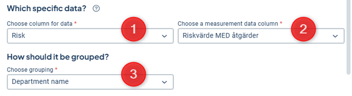
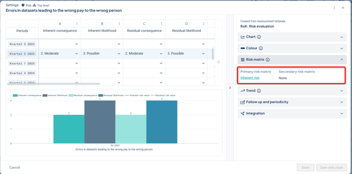
For risks: Select the column for the risks or activities you want to display the distribution for (1). For risks, the column must be of type "Risk." Then select which value in the risk you want the summary for (2) – in this example, we choose risk value. Then choose grouping (3). Read more about groupings below.
Data Grouping
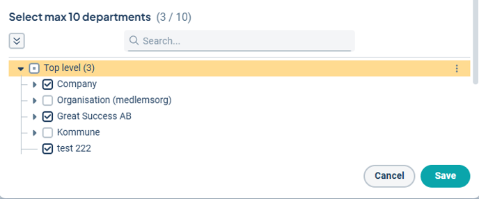
You can group data by departments or keywords.
For departments, you can select up to ten units to visualize data for. You can search by unit name and expand the entire tree to more easily find the desired units.
Tip! If you allow filtering by underlying units in the dataset, you do not need to check off underlying units at this stage. Instead, you can select only the most relevant departments to present directly. The underlying departments of the selected ones will automatically be displayed when the gadget’s content is filtered by underlying departments.
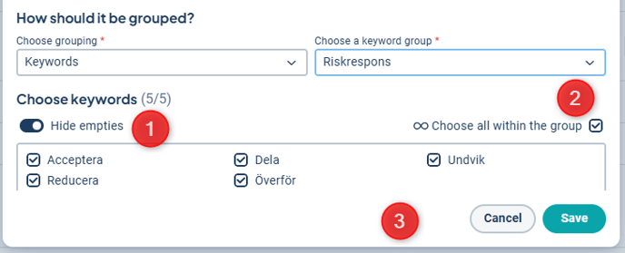
The gadget also supports grouping by keywords, where you can:
-
Hide empty keywords.
-
Select all keywords within the keyword group, thereby including future keywords as well.
-
Select specific keywords you want to group by.
Note: We recommend not including more than 10 keywords in the same visualization to facilitate clarity and data comparison.
The gadget will be named "Distribution Comparison of \[selected column]". If you want to change the name, you can do so under the Settings tab.
Finally, save your gadget. If you want to share your gadget with others in the organization, read how to do that in this article: Dashboard with gadgets.
Limitations for measure data
This gadget displays the distribution of the total number of risks per risk level as well as response option data based on a selected grouping. Therefore, you can only select from management model columns associated with a measurement template configured for response options or risk measures.
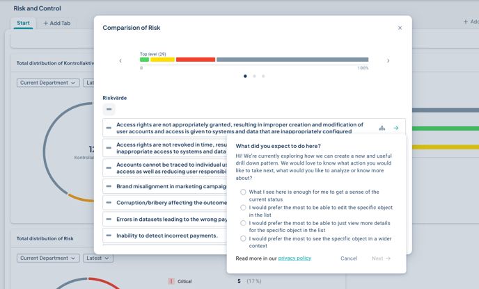
Feel free to share your feedback!
When you click the arrow while in drill-down mode, a short survey is currently displayed, as we are currently collecting broad feedback on whether and how users wish to explore data further. We encourage you to respond to the survey.
The aim is to gather input for developing a general pattern for how users can explore the data presented on a dashboard.