Administer grouping, node properties, and filters in the workspace.
If you were looking for a general description of the workspace, see this article instead: The new workspace.
Description
If you are a view administrator, you access certain features differently compared to the classic views. You also have the option to create groupings that users can then choose from. Here you will find the entry points to the most common administration interfaces:
Update from classic "Tree – drag and drop" to workspace
Grouping of measure, risk, and activity objects
Object properties in the new workspace
Tips for improving layout and minimizing width in the workspace
Additional object properties that provide overview in the new workspace
View settings and filters
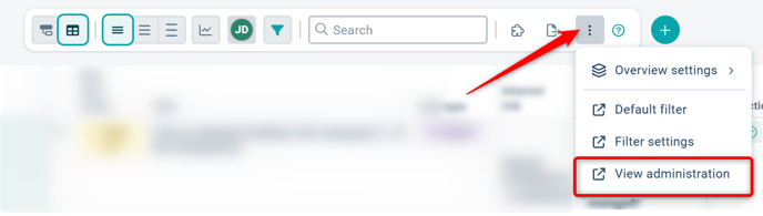
If you are a full administrator or strategy model administrator, you will find quick links to view settings, default filters, and filter settings in the three-dot menu at the far right of the toolbar above the view.
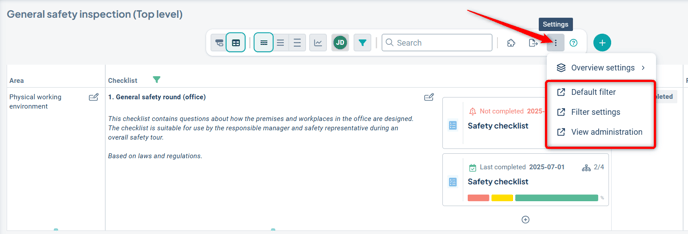
Keep in mind that not all filter settings are yet supported in the new workspace. Read more about filters in the new view.
Select default display mode
Unlike classic view types, the workspace includes several different display modes where you can choose which display mode should be the default for the workspace.
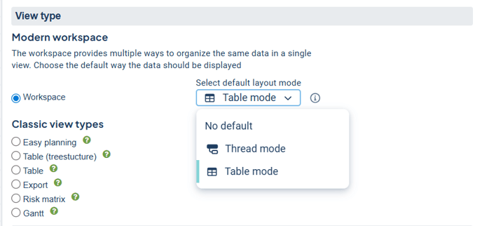
- No default setting: With this option, the user will always return to the most recent display mode they personally selected.
- Other options: The selected mode (Thread or Table) chosen by an administrator will be shown as the default for users at the start of each new session.*
*A session refers to each new login occasion and also includes when the browser is closed and reopened.
Observe!
The first time you set a mode as the default, you may need to either log in again or close and reopen your browser.
Update from classic "Tree – drag and drop" to workspace
To update a classic "Tree – drag and drop" view to the modern interface, you need to change the display mode to "Workspace".
Don't forget to review which object properties are selected and where they are placed in the object property selector before switching:
Place all object properties you wish to retain in the top section of the object property selector. Any properties that are placed in the 'Tooltip / Expanded' section will be cleared during the update. This means they will not be displayed in the workspace automatically. If needed, you can manually add them again after switching to the workspace.
Why is this important?
The workspace is based on a clearer and more structured display of object data. In the workspace, the top section is used as the source for which properties are visible and accessible. Read more about the placement of object properties further down in the article in the section Object properties.
Do the following to update:
-
Go to the classic Tree – drag and drop/Red thread view that you want to convert.
-
Open the object property selector using the puzzle piece button in the toolbar. Move the desired properties from the tooltip/expandable section to the top section of the object property selector. Arrange the properties in the desired order and save.
-
Switch from classic Tree – drag and drop to "Workspace".
-
Set "Thread" mode as the default display mode and save.
Tip!
Don’t miss reading more about thread mode, object properties, and tips on how to configure the new workspace to keep the width down.
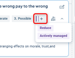
Grouping overview
The overview is based on relevant groupings configured by you as an administrator. You can create multiple groupings with different focuses that users can then switch between.
An advantage of the overview mode is that you can group by more columns than those visible in the view. This provides a summarized overview without requiring users to scroll horizontally, ensuring they receive relevant information both in the overview and in table mode.
The groupings are shown in a list on the left side of the toolbar. If only one grouping is available, no list will be displayed.
Do the following to create a new grouping:
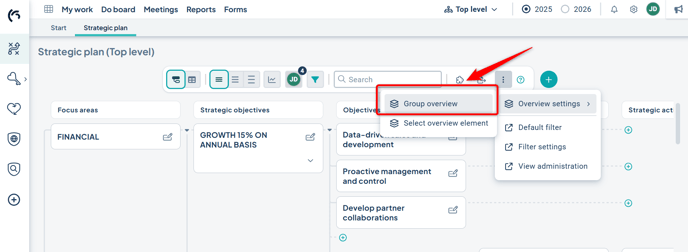
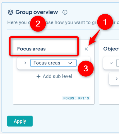
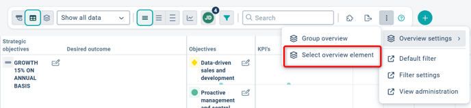
1) Select "Group overview", which you’ll find in the context menu (three dots) at the far right of the toolbar:
2) Click "Add grouping", then select the column you want to use as the focus for the grouping. You can choose from all columns available in the model. For example, if you want the workspace to show an overview of risks, select risks at this step. In practice, you are choosing what will be displayed first in the table directly below the grouping row.
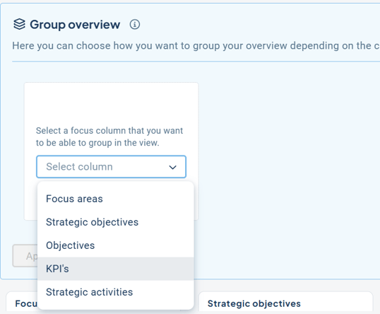
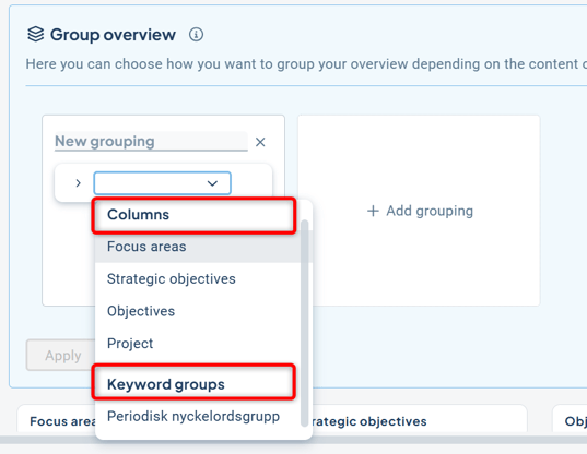
3) Then choose how you want to group your selected focus. You can group by a column or a keyword group. For columns, you can have two levels of grouping; for keyword groups, only one level is allowed. Click Apply.

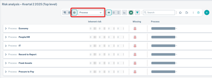
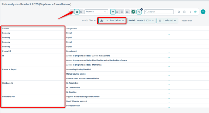
Example 1: Focus on Risk, grouping by the column Process without a sublevel:
Example 2: Focus on Risk, grouping by the column Subprocess:

In this case, risks linked directly to the first grouping (Process) are also displayed directly under that grouping. You can choose to Show or Hide objects with this type of direct connection when grouping at two levels:
Once you have created your groupings, they become available to all users through the dropdown list.
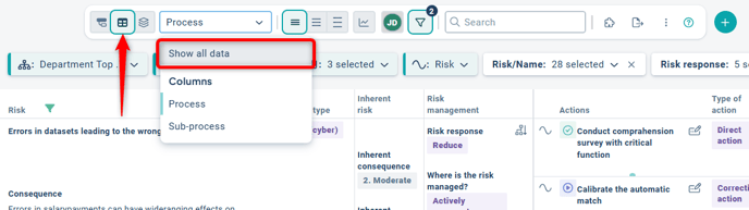
To view all data, switch to table mode and select "Show all data".
You can add multiple groupings and have different focus columns for each grouping. For example, you might want to show an overview of risks in relation to processes and subprocesses in one grouping, and actions in relation to goals and strategies in another grouping.

Edit and delete grouping
-
Delete an existing grouping by clicking the X in the top right corner.
-
Rename a grouping by clicking in the name field and entering your desired name.
-
Change elements in the dropdowns for existing groupings.
When you are done with your changes, select "Apply". No objects are modified when you change a grouping, but the display options for the view may change.
Grouping of measure, risk, and activity objects
If you display measure and risk objects or activity objects as cascaded, these objects will appear once per unit when using table mode.
When grouping, however, the object is treated as a whole, so you will only see the object as a single group in the grouping. This is not a setting—it happens automatically.
Example:
In table mode, the same process (which in this case is a measure object) is shown on a separate row for each unit when you filter on underlying levels, if the process is cascaded to multiple units:
When switching to grouping mode, in the example with focus on Risk and grouped by Process and Subprocess, only one group per process is shown even when filtering on underlying units.
This means you get a clear overview of all risks linked to the process, regardless of how many units the process is associated with.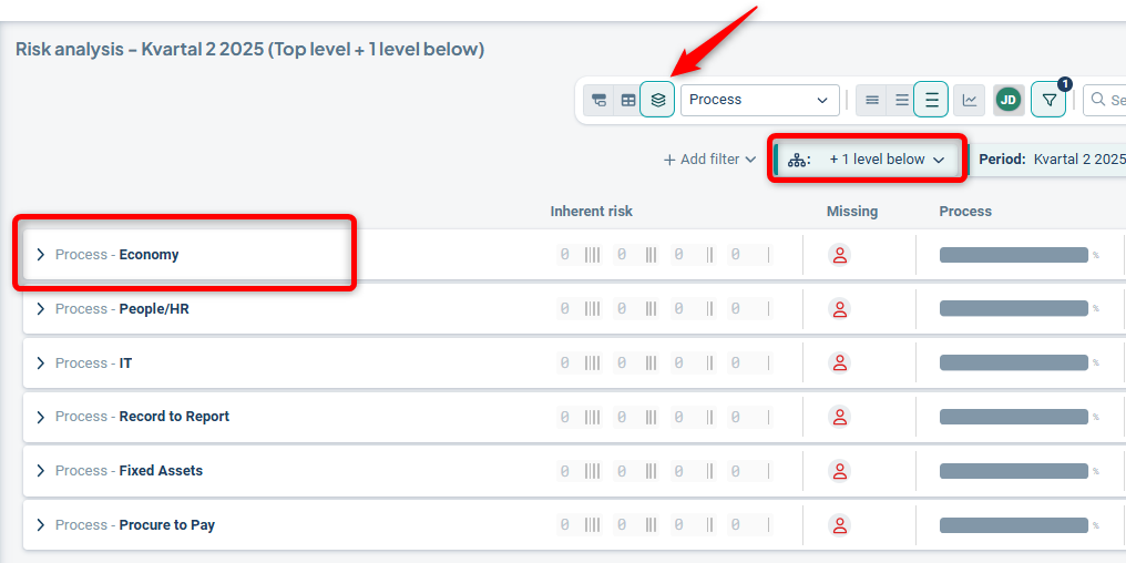
Grouping and column filters
If a grouping includes a specific column, this setting takes precedence over any column filters. Columns included in a grouping will always be displayed, even if the standard filter has filtered them out.
Tip: To avoid misunderstandings – review the standard filters associated with the workspace to ensure that they always display the grouped columns.
Example:
If, for instance, you choose to display "Strategic Objectives" in a grouping as shown below:

Then this column will not be possible to filter out via the filter funnel in the view:
"Strategic Objectives" will also always be displayed even though the Standard filter does not always show it.
Select overview elements
For the available groupings, you can add overview elements that display the status of the grouping. You’ll find Select overview elements in the three-dot menu at the far right of the toolbar.
The elements available for selection depend on the content you are displaying in the workspace. For example, if no risks are selected, you won’t be presented with suggestions for risk value distribution. Start by choosing the element you want to appear first in the table section.
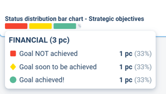
Click "Add element" and select one of the available elements. In this example, we choose the status distribution for indicators:
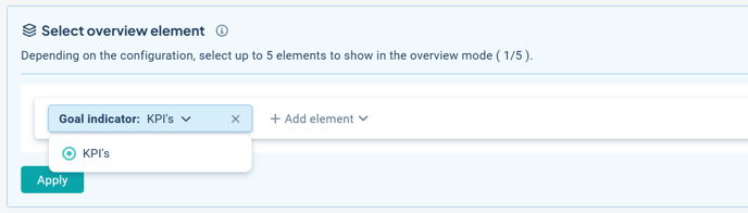
The result in the example is as follows: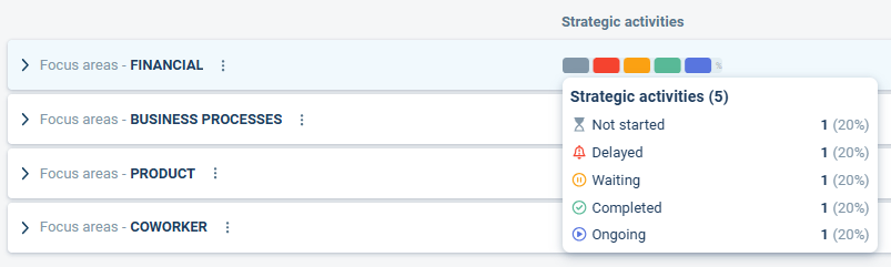
Depending on other view settings, different numbers of elements may be available, but a maximum of five elements can be added.
Status distribution bar:
- This element can be applied to all object types: text, measure, and activity objects. It shows a distribution of different status colors for the selected column.
- Limitations: The status distribution bar does not include risk measures or measures with the color setting “no color” – these will not be shown in the status distribution or its tooltip.
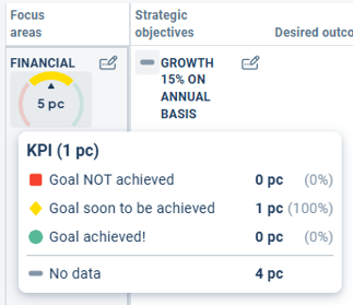
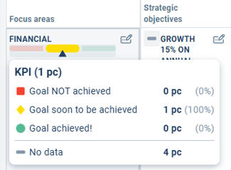
Goal indicator:
- This element can only be applied to measure objects with numerical data. It calculates the colors of the measures and generates a score, which enables the indicator to point to green, yellow, or red—i.e., to indicate a type of progress toward the goal. It is not a pure distribution but rather a calculation to show progress.
- Limitations: It cannot be applied to any measures other than those set to “numbers.”
Add visualizations
Add view gadgets to enhance the overview and visualization of data in the workspace.
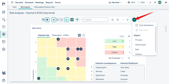
Click the plus sign (+) to the right of the toolbar at the top of the view. Then select a gadget from the menu. You can choose from the available gadgets:
-
-
-
Total distribution: Always available. Displays data for all object types and is used to provide an overview of the distribution of object statuses in the workspace.
Limitation: Filtering is not supported at this time. -
Risk matrix: Available if risk measures are displayed in the view, showing the placement of risks in the matrix. Supports filtering.
-
Emissions data gadget: Available in Sustainability products that include measures with the "Base year" formula. Used to visualize emissions data for CSRD Sustainability Management. Supports filtering.
-
-
Once you have selected a gadget, it is placed in the visualization area.
Via the three-dot menu in the upper right corner of the gadget itself, you can move the gadget, change its settings, or remove it. You can also rearrange them by dragging and dropping into a new position.
If you add multiple gadgets, you can scroll between them using the arrows on the sides (1). It's not possible to resize view gadgets, but you can temporarily hide them by clicking the visualization button in the view (2).
Allow follow-up
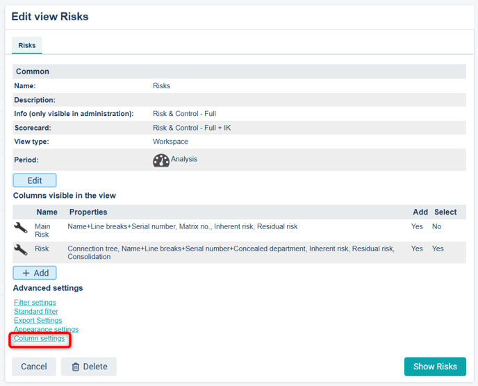
The ability to display the “pen and notepad” icon in the view is not controlled via object properties but through the column settings available in the view administration.
You access the column settings via the settings for a specific column: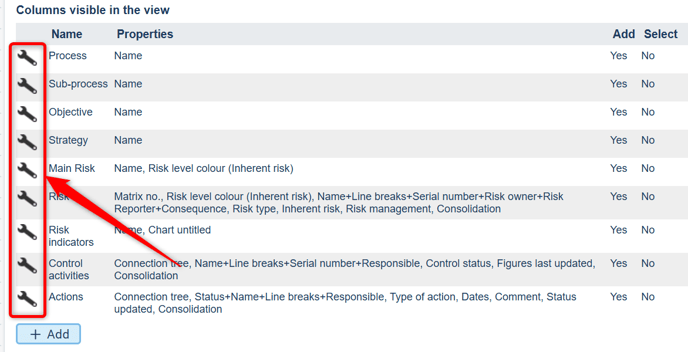
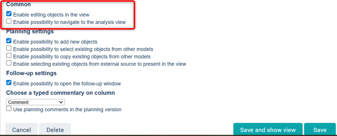
Make sure that "Enable the possibility to open the follow-up window" is checked for the desired columns.

Allow object editing
Users no longer need to click specifically on the wrench icon in the view to make changes—now the entire object is clickable. The permission to edit objects in the new workspace is not controlled via object properties, but instead through the column settings available in the view administration.
You access the column settings, for example, via the settings for a specific column:
Make sure that "Enable editing objects in the view" is checked for the desired columns.
Object properties in the new workspace
Filters, settings, and object properties are shared across all display modes (Table mode, Thread mode, Overview mode) within the same workspace. However, how they are displayed may vary.
The settings for the view’s object properties can be accessed via the puzzle piece icon  located to the right in the toolbar:

Visualization of prioritized object properties – updated design
In connection with the thread mode, we have reviewed and updated the design of object properties. Below, you can read about the design changes and the background. This design update applies to the entire workspace, i.e., both table and thread modes.
In thread mode, object properties also interact with the compact/spacious size settings, where what is shown directly on the card and how it appears depends on whether the user has selected Compact, Normal, or Spacious size.
As an administrator, you choose which object properties are displayed in the workspace. This provides a comprehensive view, but it can sometimes be too much for users to quickly find what they're looking for.
To simplify, make the overview more relevant, and reduce visual noise, we now highlight a selection of the most used and important properties – those that indicate an object's status, color, risk level, or some form of categorization.
-
Compact size: In this display mode, only the object’s name and tool icons are shown.
-
Normal size: In this mode, the selected, most important object properties are displayed, now redesigned to stand out from surrounding text. These properties are presented as labels and include the following:
-
Color | Status | Risk


- Primarily shows the condition of an object
- "Color"and "Status" can be displayed with an icon, text – or both
- "Risk"
- Keywords


- Used for various purposes where the color now matches the appearance in the object window
-
Measure data column

- Displays specific underlying data for measure objects
- Data of the type “answer options” is shown with any associated color
- Data of the type “numbers” is displayed together with a postfix if applied
- Dates

- Displays start and/or end dates for activity objects
- Department

- Displays the name of the unit to which the object belongs
Compact cards and button section in Thread mode
To make Thread mode as compact as possible, the mentioned properties adapt to the card’s width. In some cases, they are placed under a button, as shown in the example below.
The information is always displayed in the order in which the properties were added. Therefore, it's beneficial to build views based on how people process information – placing the most important elements first; those that help the user quickly determine the next step.
Properties that enable further navigation or display more detailed information are placed in a dedicated button section on the right, as shown in the example above. This section does not adjust to the card’s width – the buttons are always visible and directly clickable.
The following properties are displayed in the button section if an administrator has selected them:
-
Responsibility roles: Indicates whether someone is responsible for the object. Clicking shows name, unit, and role.
-
Consolidation: Indicates whether the measure is distributed to multiple units. Clicking navigates the user to the object’s consolidation view.
-
Connection tree: Shows how the object is linked. Clicking displays all connections the object has to other objects, products, and strategy models.
-
Measure relationships: Displayed if measure data is aggregated to an adjacent column in the structure. Clicking reveals deeper information about how the data is aggregated. Read more in the article on Measure relationships.
Spacious size: In this mode, the user sees all object properties (in addition to those already shown directly on the card) that the administrator has selected in the workspace, as all cards are expanded in this view.
Tips for improving layout and minimizing width in the workspace
Information in the workspace is always displayed in the order in which properties have been added. Therefore, it's beneficial to structure properties based on how people process information – placing the most important elements first; those that help users quickly determine the next step.
As an administrator, you have the opportunity to customize workspaces to make them more user-friendly and easy to navigate. By thoughtfully placing object properties, you can reduce the need for horizontal scrolling while enhancing the user’s cognitive experience. Here are some tips:
Apply the principle of proximity
Group related object properties close to each other. According to the Gestalt principle of proximity, this helps users quickly perceive relationships, reducing cognitive load and making information easier to absorb.
Highlight important information
Create a clear hierarchy by emphasizing the most relevant object properties. Our new design for certain properties makes it easier to scan the page and find the right information. Don’t hesitate to place important properties below the object name instead of beside it if it improves readability!
Use columns wisely
Place similar information in the same columns, preferably on the left. These columns often take up more vertical space because objects can have linked sub-objects.
Such a layout makes it easier for users to detect patterns and relationships, which supports both comprehension and decision-making.
Additional object properties that provide overview in the new workspace
With the migration to a new technical platform, several properties used for overview—previously presented with a classic visual style—have received new designs and revised settings.
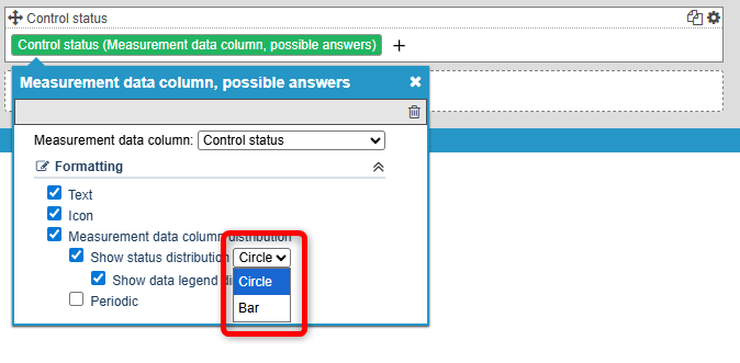
Measure column, answer options
This property is used to show the distribution of how underlying units have responded to a measure distributed across the organization where answer options are applied.
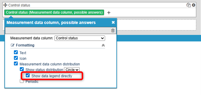
New after the migration: it is now possible to choose between a pie or bar appearance (image on the left) in the settings, and whether data labels should be shown directly in the workspace or not (image on the right).
Setting for pie or bar
Setting to show data legend or not
In the view with the "pie" appearance, the settings look like the top section of the image below.
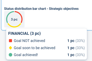
On the left, the option to "show data labels directly" is enabled, while on the right it is disabled. In that case, detailed information is displayed instead when the user hovers the mouse pointer over the visualization.
Circle with data legend Circle without data legend

Bar with data legend Bar without data legend

In the "bar" appearance, the settings are displayed as shown at the bottom of the image above. On the left, the option to "show data labels directly" is enabled, and on the right, it is disabled. Here too, detailed information is shown when the user hovers the mouse over the visualization.
Advantages of not showing data labels directly include reduced visual space usage, which can help minimize scrolling. It also helps reduce information noise.
Goal indicator
The property previously called “gauge” or “meter” has been renamed to “Goal indicator” for consistency with the overview element of the same function.
This property is used to show progress by aggregating the colors of linked measures in the column where the property has been applied. Based on this, it indicates how you're performing.
-
Applies to measures where automatic or manual color is used.
-
The property is added to columns to the left of strategy model columns of type “measure” for which the data should be aggregated.
New functionality includes the ability to choose between arc or bar appearance (image on the left) in the settings, and whether to display data labels directly in the workspace (image on the right).
You also select the “Column”, which is the strategy model column whose color will be calculated.
Example: You want to display overall progress for your “Focus areas.” Therefore, you apply the property to “Focus areas,” which is placed on the left side of the workspace.
Then you select the strategy model column to the right of “Focus areas” that contains measures whose data should be aggregated and that are linked to “Focus areas.”
Setting for arc or bar Setting for data legend


Observe!
The property is designed to indicate goal progress by aggregating data from measures using automatic or manual color settings. If you select a column that also includes answer options with “custom color”, those will not be included in the visualization.
For answer options with custom color, we recommend using the “Status distribution bar” property instead, which displays the distribution of colors. You can read more about it further down in the article.
With the "arc" appearance, the property is displayed as shown in the image below. On the left, the option to "show data labels directly" is enabled, and on the right, it is disabled. When labels are not shown, detailed information is displayed when the user hovers the mouse over the visualization.
Arc with data legend Arc without data legend

With the "bar" appearance, the property is displayed as shown in the image below. On the left, the option to "show data labels directly" is enabled, and on the right, it is disabled. When labels are not shown, detailed information is displayed when the user hovers the mouse over the visualization.
Bar with data legend Bar without data legend

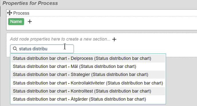
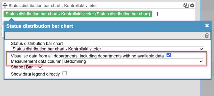
This property is used to display the distribution of color or status for text, measure, and activity objects.
It functions similarly to the goal indicator, as it is applied as a property on the column to the left of the one you want to display the distribution for.

Example: You want to display the status of your control activities for your processes. You apply the property to the "Process" column. There, you select which of the strategy model columns to the right of "Process" the property should display the distribution for.
Here too, you can choose to visualize as a "pie" or "bar", with or without data labels:
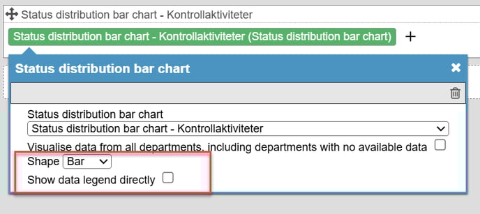
Show data labels directly or not?
Whether to display data labels directly in the workspace is a trade-off. The advantages of not showing them directly include saving space and reducing both scrolling and information noise. It also depends on how much other data is being displayed in the view.
Don't miss our general tips for improving layout and minimizing width in the workspace!
Replaced node properties in the new workspace
Certain properties from classic views are now configured via column settings in the new workspace. This applies to:
-
Edit window
-
Follow-up window
-
Analysis view
-
Documents
If you convert a classic view to a workspace, these will appear as “Invalid node property” in red for the affected column.
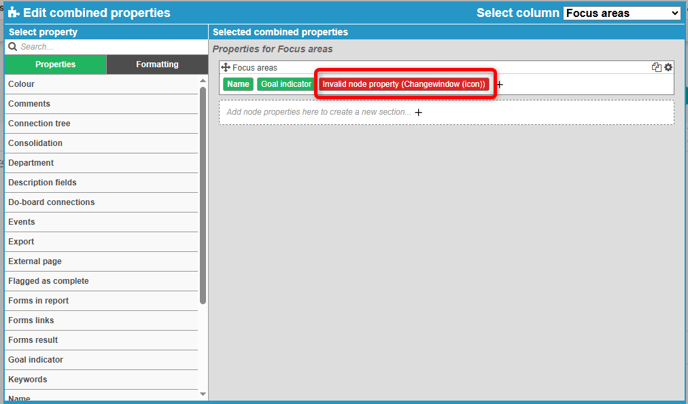
In this case, you should remove the node property and instead enable the corresponding setting in the column settings, which can be found at the bottom of the view settings. The corresponding functionality will then appear in a standardized location in the new workspace (Note: the Edit window typically has no icon, since editing is done by clicking the object directly).
Replace as follows in the column settings for the relevant column:
-
Edit window: Enable the option to edit objects in the view
-
Follow-up window: Enable the option to follow up on objects
-
Analysis view: Enable the option to navigate to the analysis view
-
Documents: Show attachments for the following columns