Chart in the measurment settings
Administration chart settings
Charts are used to visually represent data. As an administrator, you have access chart settings in in the administration menu "Measurement settings > Chart".
Chart templates
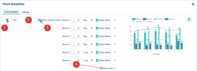
Under the Chart templates tab, you can create templates for charts. You can mark which Chart should be the default template used for new measurments, which is indicated by a flag to the left of the chart template.
1) Default Chart Template. Select which Chart Template should be the default by clicking the flag.
2) Chart title. Specify or change name here.
3) Select to show or hide horizontal support lines.
4) Series. Specify the look for a number of data series. Add more with "Add series +".
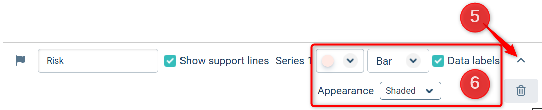
5) Expand each serie using the arrow in the top right corner to change te look and feel of the serie (6).
Save the page when done.
Add Chart template
Click the "Add template +" button in the end of the page to create a new template.
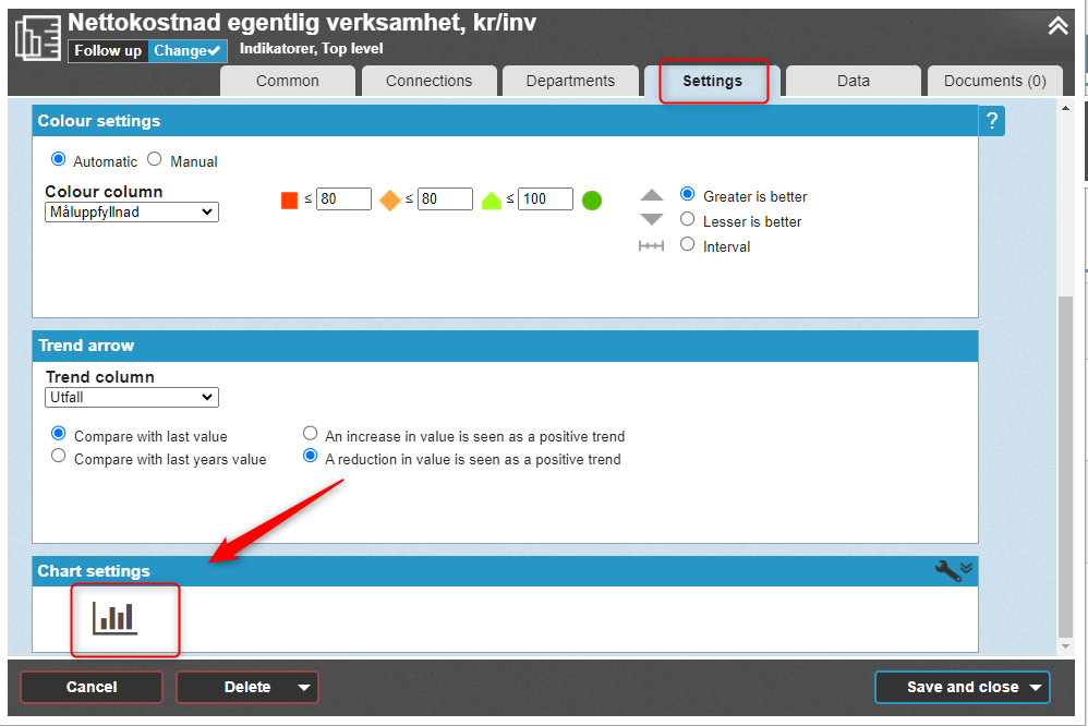
Chart Settings
General: Delete all blank periods (blank periods are normally only deleted at the start and end of a diagram) as standard by checking this box.
Size: You can define the size in pixels for charts in different node properties. Click on the value you want to change and enter the new value. Save your changes.
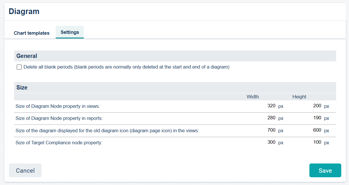
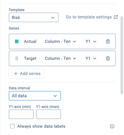
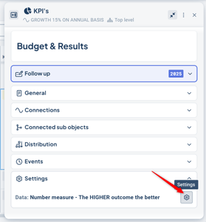
Chart settings in measure objects
Charts displayed in views always belongs to an object. You can configure the chart settings for each induvidual measure, if needed.
Open the measure settings and select the Chart section on the upper right side.
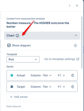
If you use the the classic change window, you find the Chart settings in the bottom of the Settings tab:
In the chart settings, you can change the template to apply another default design.
You can adjust the series - add, remove or change look and feel.
Choose what data poins you want to display in teh Data interval drop down.
You can also use separate Y-axis for different data series. This is useful if you hva a big range in values for different series.