Configure your measure to suit the purpose it is intended to measure.
Measure Settings Window
Many of the measure’s settings are already preconfigured for you through the measure template used to create the measure. If you want to change the settings for all measures using the measure template, see the article about Measure Templates.
If you want to adjust a property for this specific measure, you do so here in the Measure Settings.
Accessing Measure Settings
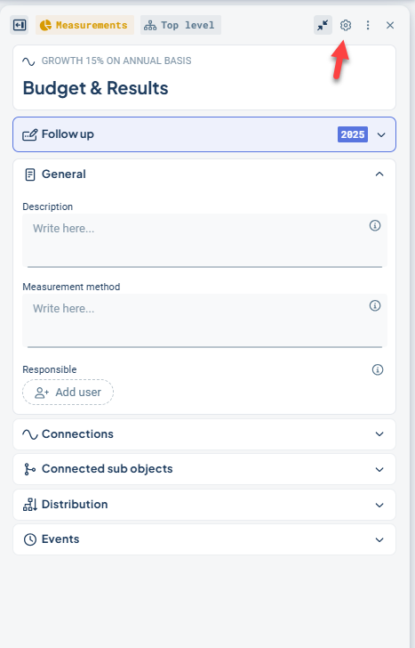
You can find Measure Settings under the Settings section in the object window when you open it for a measure. Measures may have many different names, but are always visualized with a pie chart in the object window.
Click the gear icon on the right.
The window that opens is interactive, and many of the changes you make can be previewed before saving.
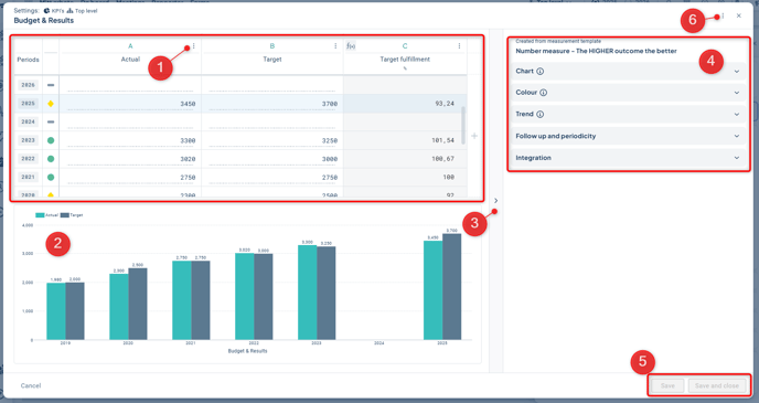
The window consists of the following parts:
-
At the top left, you’ll find the measure data columns with their data values. In the context menu (three dots) for each column, you can configure formulas and other properties. You can also reorder the columns from this menu.
-
At the bottom left, you can see how a chart of the measure would currently appear with the selected settings. The preview updates interactively with changed chart settings and data values.
-
Between the sections, there is a divider that allows you to expand the left section, if you have many measure columns you want to review.
-
On the right, you’ll find general settings such as color, trend, and chart settings.
-
At the bottom right, you can Save or Save and Close. These buttons are activated as soon as there is a change to save, and are then greyed out until the next change is made.
-
If any setting is missing, you can open the classic edit window to make your changes there. You’ll find the context menu for this at the top right of the window.
Measure Data Columns
In the measure column section, you can see the reporting periods on the far left and the measure data columns to the right. The view can be scrolled both vertically and horizontally.
-
In the column header, you see the name of the measure column, for example “Target”. If the column has a calculation formula or consolidation, this is indicated with icons on the left.
-
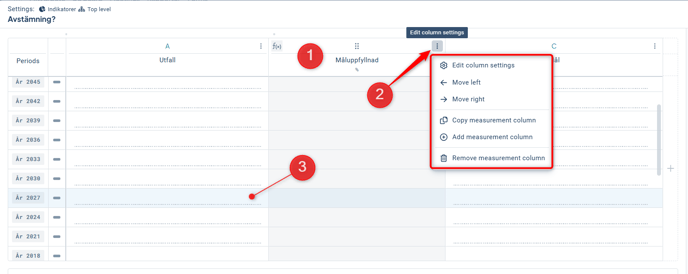
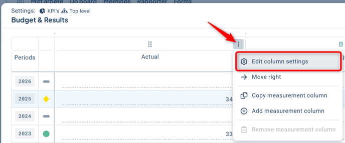
Through the context menu (three dots), you can access the column settings for each measure column. You can also change the order of the columns here, and add and remove columns as needed. Observe that you cannot remove columns that are currently used in a calculation. In that case, first change the calculation.
-
In the table itself, you can report data in the cells that are open for reporting. Reporting may sometimes be locked, for example due to calculation formulas, consolidation, or if the column is integrated.
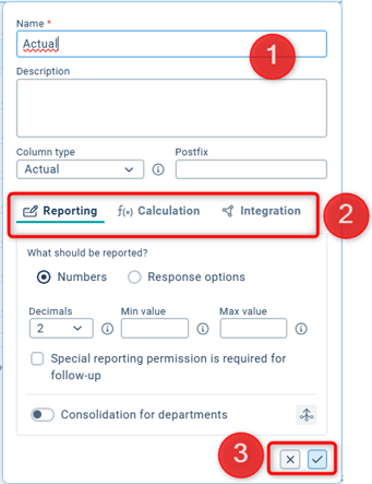
Edit Column Settings
Click Edit column Settings in the context menu for the column you want to adjust to open a new window.
-
In the top section, you can edit the name, description, and column type. You can also specify a postfix, such as "%", which will be displayed after the data value in views and reports.
-
In the next section, you can choose between three different tabs – Reporting, Calculation, and Integration. These are described in more detail below.
-
When you are satisfied with your changes, click the checkmark in the lower right corner (or the X if you do not want to apply the changes). However, the changes will only be saved once you save in the main window.
Reporting
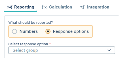
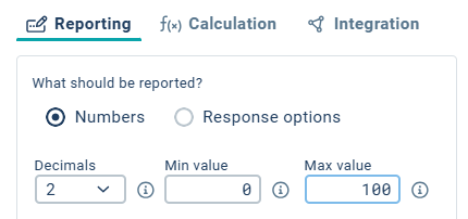
Choose whether the measure data should be reported using numbers or response options. For response alternatives, select which response option group should be used.
For numeric input, you can specify the number of decimals to be used during entry. All decimals are used in calculations regardless of this setting, but only the specified number of decimals is displayed.
You can also define a minimum and/or maximum input value.
You can check “Special reporting permission required” if you want only users with the corresponding permission to be allowed to report in the data column.
At the bottom, you configure consolidation for the column. This option becomes available only after the object has been distributed to underlying units.
Note: A change in consolidation can result in data loss. Make sure you understand the implications before proceeding.
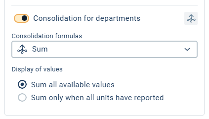
Also note that in most cases, you should not use both consolidation and calculation on the same column. If a calculation is needed on the column, do not enable consolidation. Instead, consolidate the data columns used in the calculation.
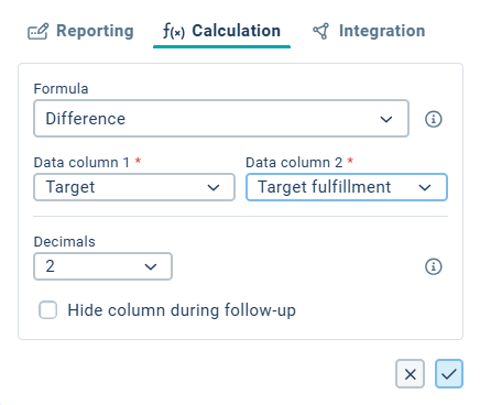
Calculation
If you want to calculate values, this is where you define the formula for the column. Use Data Column 1 and Data Column 2 as the columns the calculation should be based on. Some calculations may only require one column.
Read more about Calculation Formulas.
Tip: In the manual’s description of calculation formulas, Data Column 1 corresponds to the "Actual" column and Data Column 2 to the "Target" column.
Calculations are most commonly performed using numeric values, but response alternatives can also be used. See the Reporting tab above for more information on response alternatives.
You can specify that your calculation column should be hidden during follow-up, which is useful for columns used for intermediate calculations that don’t need to be displayed. These columns will not be visible in the follow-up window.
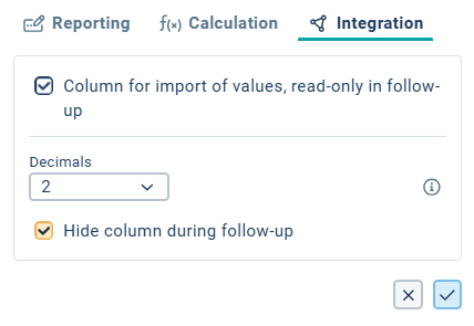
Integration
In the Integration tab, you can mark the column as “Column for importing values…”, which protects the column from manual data entry by users. Use this option when data values are imported via file import, APIs, or measure column integration.
Here as well, you can specify the number of decimals to be used and choose to hide the column if needed—see the Reporting and Calculation tabs above.
Övriga inställningar
Measure Template
Directly under the Settings heading, you can see which measure template the measure was created from. This can be useful information if you want to change a property for multiple measures, which you would then do from the linked template. Read more about Measure Templates.
Follow-up and Periodicity
Under Follow-up and Periodicity, you can change the periodicity of the measure as well as the reporting start period by clicking the pencil icon (1). In the dialog, you can read more by clicking the information icons before making any changes.
Note: If the measure already has reported data and/or comments, changing the periodicity may result in data loss
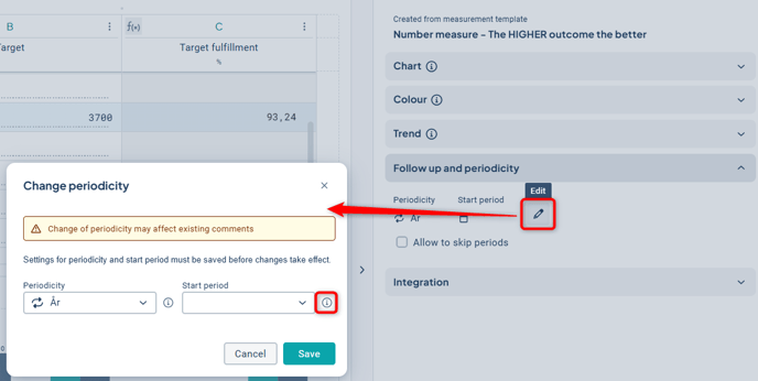
If you check the box “Allow skipping periods”, checkboxes will appear to the right of the period text in the data section, which can be unchecked for periods where reporting should not occur.
You can also choose whether all underlying units should be exempt from reporting by checking “Unchecking period applies to the entire consolidation chain.”
No reminders to report will be sent for unchecked periods.
Colour
The colour settings provide a visual indication of how the result of the measure should be interpreted.
With the Automatic setting, the colour is determined by predefined calculations and threshold values. The best practice is to use a calculated percentage value, as this makes the thresholds percentage-based and therefore easy to set and understand.
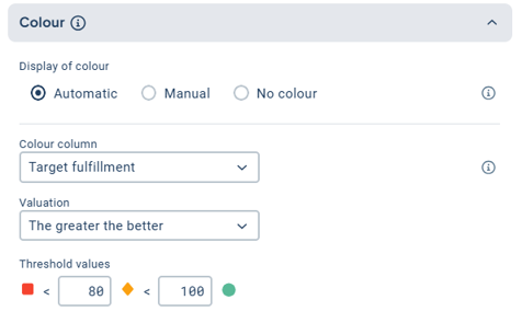
For the Color Column, select the column that best reflects the measure’s performance, such as goal fulfillment.
With the Manual setting, the user manually assigns a color during the follow-up.
No color is used when no visual indication is necessary, or for risks where the color instead comes from the risk matrix.
For these options, you specify a Period Column. Select the column that best indicates whether the period has been fully reported.
Color also has other functions in Stratsys. Read more about color settings in this article.
Trend
With the trend setting, you can display how the measure is progressing in views and reports using the node property “Trend.”
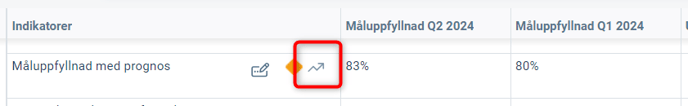
Use the column that best reflects the performance of the measure, usually the same column as used for the color setting.
Read more about trend in this article.
Chart
The measure can be visualized as a chart. You can adjust which columns (series) should be displayed in the chart and define their style. On the left, you’ll see a live preview of how your chart will be visualized using the existing reported data in the measure.
The chart settings differ slightly in the new object window, primarily in that all series properties are displayed directly in the interface.
The settings are described in detail in this separate article: Chart Settings.