Display the status of metrics and activities directly on your dashboard for selected areas and goals.
This article covers this specific gadget. Read about how to add and manage gadgets on the dashboard here.
Description
The Goal Status gadget visualizes the progress of a selected goal based on a calculation of the status of linked measures and activities. For measures, the color is assessed, and for activities, a status distribution is shown.
You select a goal/area for one or more organizational levels, and the gadget then displays progress and the status of linked measures and/or activities.
To display the status of multiple goals, create one gadget for each goal you want to track.
The Goal Status gadget is interactive and can be placed on product dashboards and "My Work".
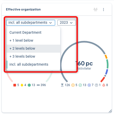
In the gadget, you can choose how many underlying levels should be displayed, and it is also possible to show measure colors from another period. These changes are temporary and only affect the individual user.
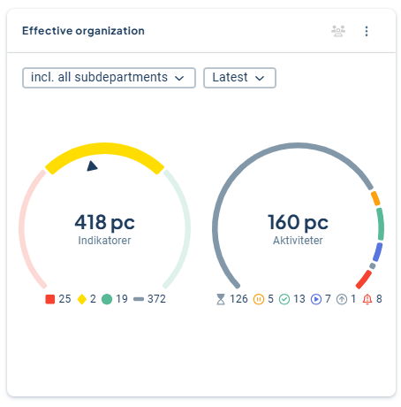
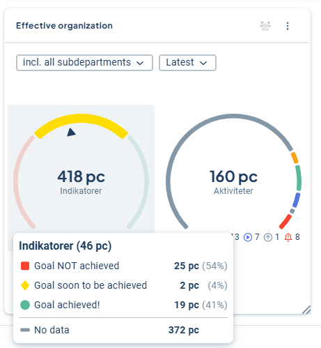
Måttmätaren visar:
- Totala antalet mått som är kopplade i aktuell version baserat på filtrering på underliggande enheter (se även begränsningar)
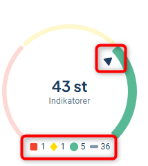
- Ett sammanvägt resultat som illustreras med en pil i visaren som pekar mot rött, gult eller grönt baserat på vald period.
- Under mätaren visas hur många mått som finns med en viss färg för de ingående måtten. Grått avser att färg saknas. I bilden nedan är 5 av 7 mått med färg gröna, vilket gör att pilen lutar mot grönt.
The gauge shows:
-
The total number of measures linked in the current version based on filtering of underlying units (see also limitations)
-
A weighted result illustrated with an arrow on the gauge pointing to red, yellow, or green based on the selected period
-
Below the gauge, the number of measures with each color is displayed. Gray indicates that no color is set. In the example below, 5 out of 7 colored measures are green, which causes the arrow to lean toward green.
The activity gauge shows:
-
The total number of activities linked in the current version based on filtering of underlying units, regardless of the selected period.
-
A distribution of the statuses of the activities. The selected period has no effect here, as status is not period-dependent.
-
Below the gauge, the number of activities with each status among the included activities is displayed.

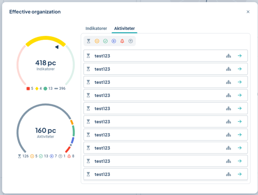
List view
You get more information by clicking directly in the gadget, and can, for example, filter by measure color or status to get an overview. It is also possible to filter and view the measures that have not yet been reported and therefore lack color.
In the image below, an overview of delayed activities is provided, where you can also see who is responsible and which unit the activity belongs to by hovering over the elements.
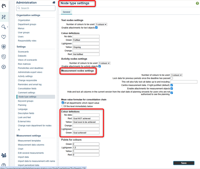
If you have your own definitions specified for the colors of the measures, these will be displayed in the gadget.
You configure these texts in the administration's Node type settings.
Prerequisites and permissions
- You need to have a product license.
- An underlying data selection (dataset) needs to be created in order to add the gadget to dashboards. Full administrators can create datasets. Read more here: Dataset.
- The gadget can be added to product dashboards and "My Work" by full administrators, except on product dashboards. There, owners can also create the gadget.
- To visualize measure data, you need to work with measures set to "automatic color."
Create a Goal Status Gadget
The gadget is based on a customized dataset. For this gadget, your dataset needs to include:
-
At least one management model column representing the measures you want to visualize progress for, and/or the activity column you want to show the status distribution for.
-
At least one management model column to group all data by. Common use cases include selecting focus area, perspective, strategy, or goal.
The dataset may contain more information than what you want to display in the gadget. It is also possible to prefilter your dataset. Read more about datasets here.
Now you can add the gadget to product dashboards or "My Work."
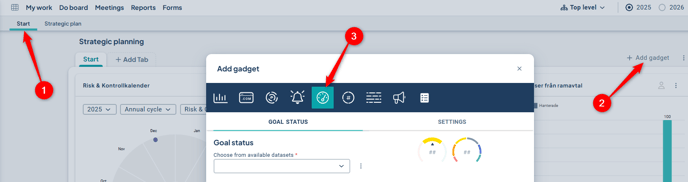
From your dashboard (1), click on Add gadget (2) and select Goal Status (3):
Start by selecting a dataset. If you don't have a suitable dataset, you can go directly to the administration from here if you are a full administrator.
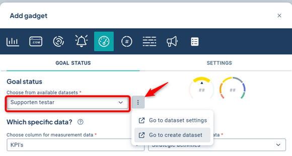
Then select the column for the measures and/or activities you want to display status for.
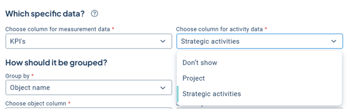
If you only want to display one type, select "Do not display" for the other. Can't find the column you want to display? See Limitations regarding measure data below.
Choose to group by object name and select which column and object (node) to group the information by.
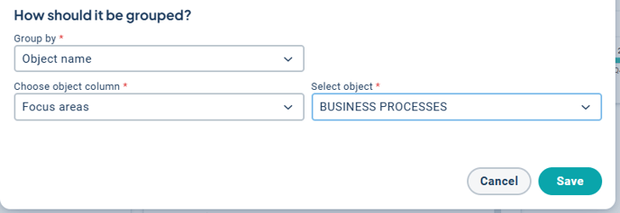
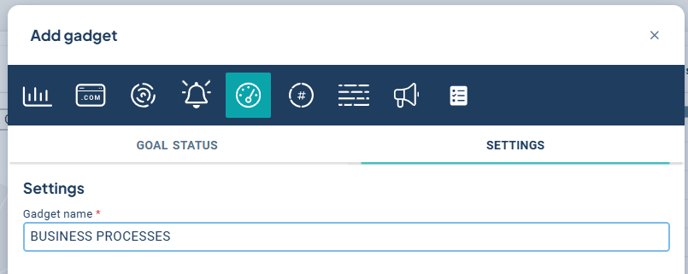
When you save the gadget, it automatically gets the same name as the selected object. Under “Settings,” you can change the gadget name to something else before saving.
Finally, select “Save.” Read more about how to share your gadget with others in the organization here: Dashboard with gadgets.
Since the gadget can display activity data grouped by object name, this corresponds to functionality currently also available in the Progress Overview gadget.[LINK]
The Progress Overview gadget will therefore be phased out, especially since visualizations based on datasets handle large volumes of data much more effectively than older gadgets.
To create an overview of activity status, we therefore recommend using the 'Goal Status' gadget instead.
Limitations
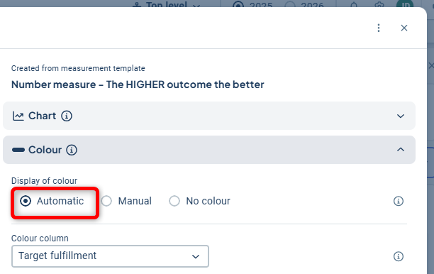
This gadget visualizes progress based on a calculation derived from the color of the measure data. Therefore, you can only select measures set to "numbers" and "automatic color".
The gadget does not support measures with the settings "manual" color, "no color", or measures of the types "response alternatives" or "risk measures". Only columns from a measure template set to "automatic color" can be selected.
Scorecard columns that entirely lack measure templates with the "automatic color" setting will therefore not appear in the list of selectable columns when configuring the gadget.
If you have a scorecard column where the measures have mixed settings and at least one measure is set to "automatic color", the column will be selectable.
However, only measures with "automatic color" will be displayed in the visualization.
To visualize data from response alternative or risk measures, we instead recommend our other gadgets "distribution comparison" or "total distribution", which only show distribution and do not calculate progress based on the color of your measure data.
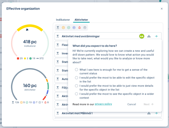
Feel free to provide feedback!
When you click on the arrow, a mini survey will currently appear as we are presently collecting broad feedback on whether/how users wish to explore further. We encourage you to complete the survey.
The goal is to use this as a basis for developing a general pattern for how users can delve deeper into the data presented on a dashboard.