Information in a view can be displayed in different ways
The information displayed in a view is determined by which columns have been selected, which properties within these columns are shown, as well as filter settings and filters.
Normally, your views already use the most appropriate display mode, but for customers not yet using our standard products, it may sometimes be appropriate to change the display mode.
As an administrator, you can also copy an existing view and choose to display the same information from a different perspective in the same menu. See also View Settings for Classic Views and View Settings for the New View Type.
Below, we describe the most commonly used display modes.
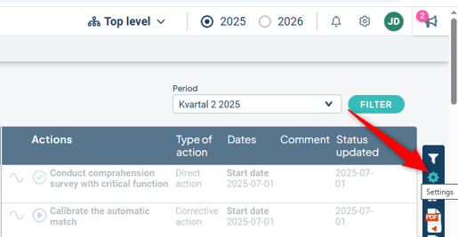
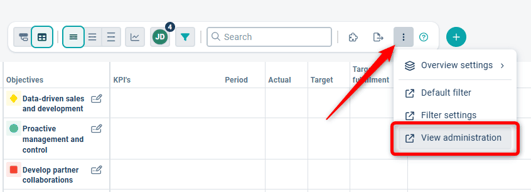
Access the Administration Section
To change the display mode, go to the view settings and click the Edit button:
Or:
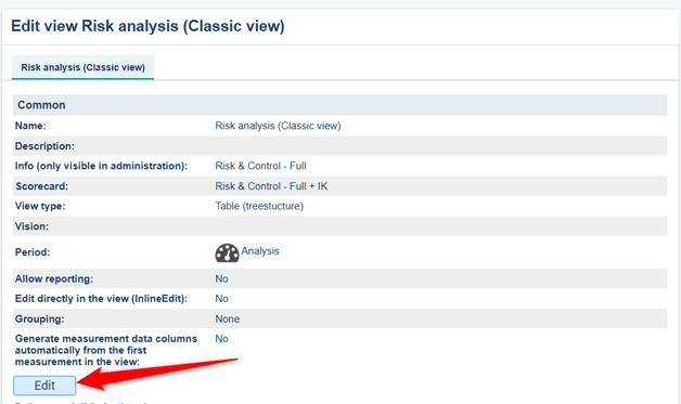
Each display mode includes a help text. Select the desired type and then save the view settings
Note: Some display modes will be phased out during 2025, and these can no longer be created. Read more here: Features being retired during migration
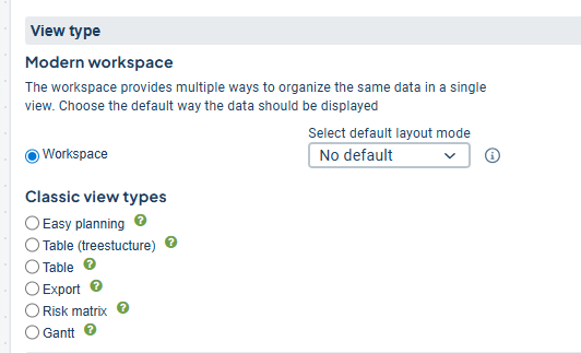
Display modes for views
New Table-Tree View
Our recommended display mode. This is the most modern view, offering flexibility and built-in support for the risk matrix. It is suitable for most process steps. Read more in this article: New view type.
Classic view types
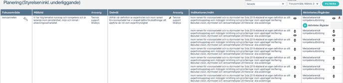
Easy Planning
Well suited for visualizing goal breakdowns, as it provides clear connections between each column and node in the view.

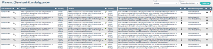
Table (treestructure)
Aims to present a compact view where the relationship between how many nodes are linked to each node in the left-hand columns is clearly shown across the columns in the view.
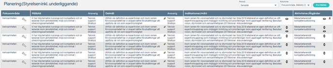
Table
The most compact display mode, suitable for views with large volumes of information.
You have the option to pin important columns by clicking the pushpin icon in the column header, ensuring they remain visible when scrolling horizontally in wide views.
You can also sort content by each column directly in the view and export the entire view to a format compatible with, for example, Excel.
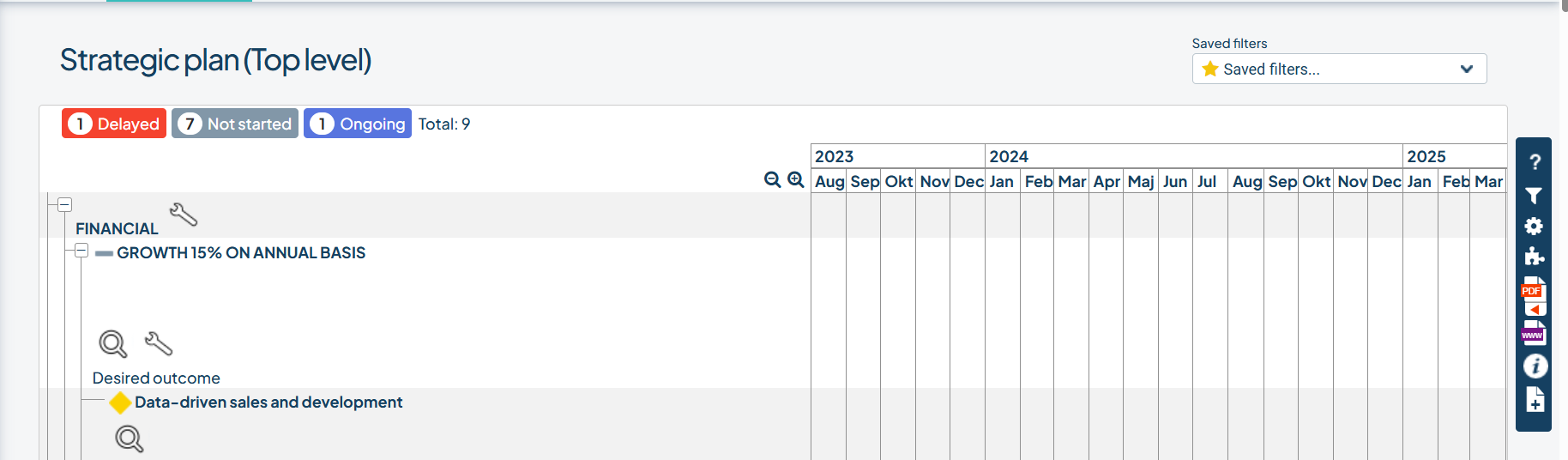
Gantt Chart
A Gantt chart is a graphical representation of the activities planned for the current year. The activities are displayed horizontally, visualizing each activity's execution period, start and end dates, and status.
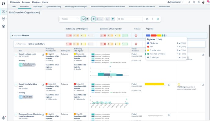
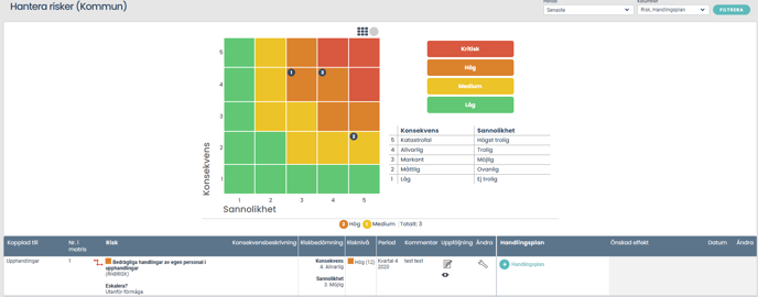
Risk Matrix
This view displays a classic risk matrix combined with an underlying Table view or Tree Table view, allowing you to list risks both within the matrix and in the view itself.
Read more in this article: Risk Matrix
Export
This view is used to automate data export to other systems and is not intended for regular users to work in.
Read more in this article: Export Views