Risks are KPIs that exist in a control model of type Risk Matrix. These nodes have access to the KPI's "regular" color, which is managed through the KPI's settings, as well as the color they receive based on their position in the risk matrix (risk level color), which is displayed with a separate node property.
Currently, it is not possible to disable the regular color for risks.
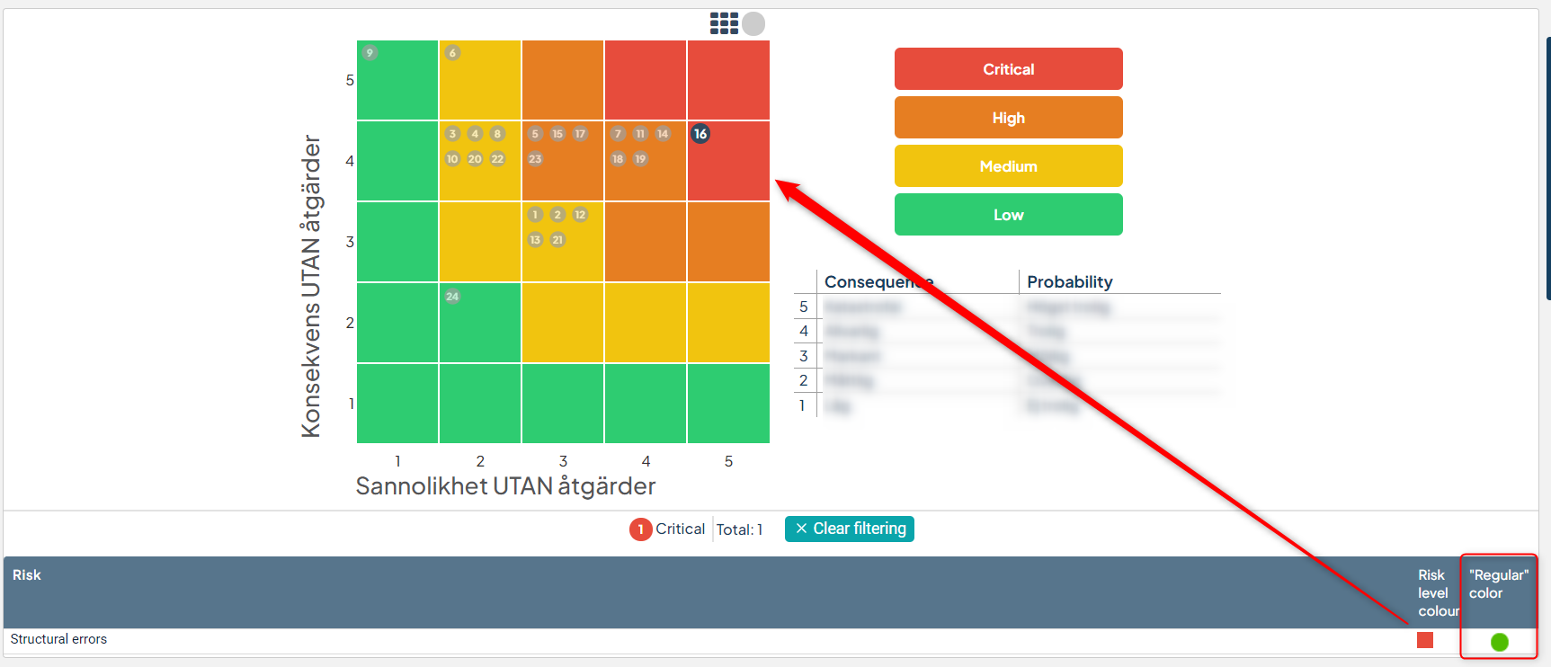
Below is an example of risks with an red (Critical risk) risk level color and a green regular color:
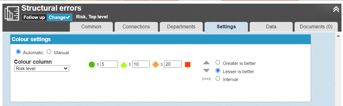
The regular color is configured in the settings of the risk KPI. In this case, the color is set to "Automatic" for the value of the KPI column "Risk level" - this color is not relevant to the risk itself:
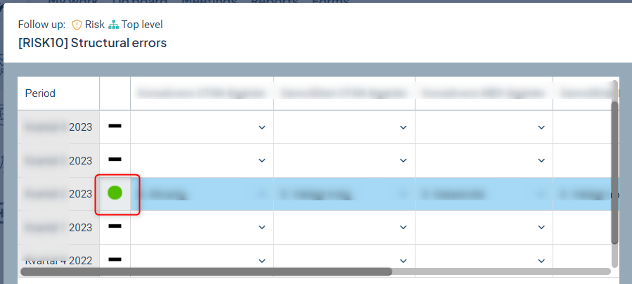
In views and reports, you can choose whether the regular color should be displayed or not through node properties. However, in the follow-up window, the regular color is always displayed in the data table on the left, which can be confusing since this risk is not "green" in terms of risk level:
There are two ways to handle this:
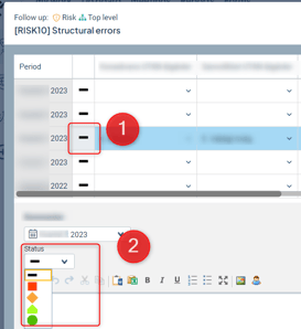
1) Use manual color instead. The advantage is that the color is not automatically set and displayed, but instead becomes a neutral black line (1). The disadvantage is that users have the option to manually set a color in the follow-up window instead (2):
2) Configure the underlying view and the analysis view displayed in the follow-up window to show the risk level color in the right view for increased clarity.
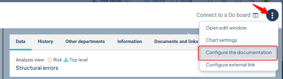
You reach the configuration for the underlying view from the follow-up-window, here:
The Analysis view is the same as the Consolidation view - click on the consolidation icon for a risk, and then go to settings via the gear icon.